Before the age of digital photography, before Instagram influencers and YouTube skiing channels, there were posters. Vivid, bold, graphically brilliant posters that made the mountains look like the most exciting place on earth. The golden age of ski poster design — roughly 1920 to 1965 — produced some of the most iconic commercial art of the twentieth century. Here is the story of how it happened.
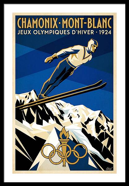
The first Winter Olympics, held in Chamonix in 1924, marked a turning point. Skiing was no longer just a local mountain activity — it was a sport, a lifestyle, and increasingly, an aspiration for the growing middle classes of Europe and America. Railways and later airlines needed to fill seats in winter, and the travel poster was their primary marketing tool. The style of the era was Art Deco: bold geometric shapes, strong diagonals, a limited palette of three or four colours, and lettering that was part of the composition rather than an afterthought.
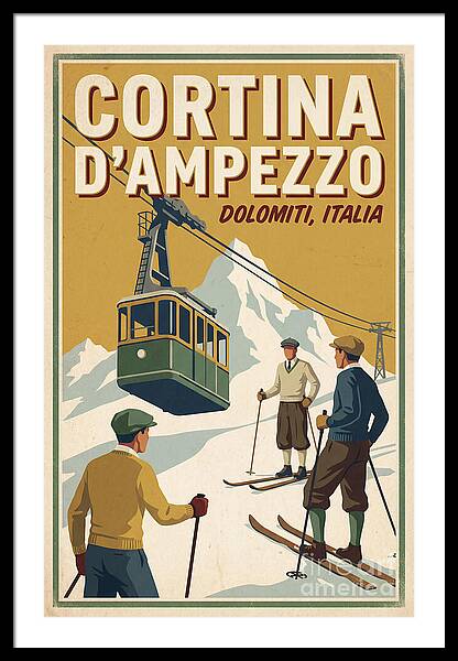
The 1930s saw the ski poster mature into a genuine art form. Artists like Roger Broders for PLM Railways and Herbert Matter for Swiss Tourism produced images that are still recognised and collected today. The typical composition — a skier in dynamic mid-motion against a stylised mountain background — became the genre's defining visual language. Resorts like Kitzbühel, St. Anton, Chamonix, and Cortina d'Ampezzo commissioned these works to build international reputations, and the posters they produced are inseparable from the identity of those places.
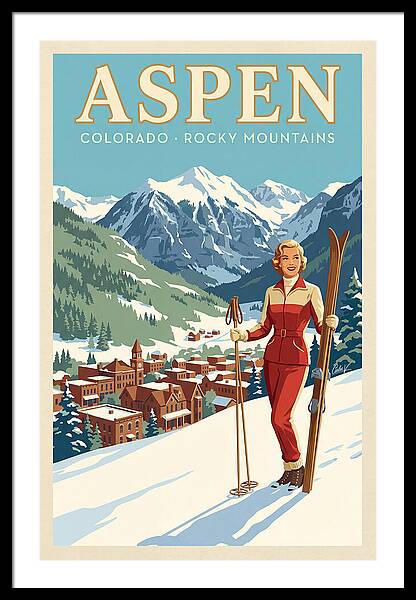
Post-war prosperity brought a new wave of ski tourism. The 1950s poster style softened slightly from the hard-edged Art Deco of the 1930s — colours became warmer, compositions more illustrative, the human figure more naturalistic. American resorts — Sun Valley, Aspen, Breckenridge — began producing their own poster traditions, mixing European elegance with a distinctly Western openness. Italian resorts like Cortina and Madonna di Campiglio reached their golden era, producing some of the most beautiful and sought-after imagery of the decade.
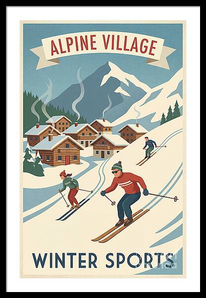
By the 1960s, ski tourism had become a mass phenomenon. Resorts like Courchevel, Verbier, and Méribel were purpose-built for the new skiing masses. Poster design shifted with the times: photography began to compete with illustration, and the clean lines of modernism replaced the romantic warmth of the 1950s. The best 1960s posters have a cool, graphic energy — flat colours, bold typography, and a sense of speed that reflects the decade's optimism.
Vintage ski posters endure because they are simultaneously art and memory. They capture a version of the mountains that feels both authentic and slightly mythologised — a world of wooden lodges, leather boots, and long afternoons in the sun. For those who ski, they connect to something felt on the hill. For those who don't, they promise adventure. Either way, they are among the most enduring examples of commercial art ever produced.
Ready to find the perfect print for your mountain home?
Shop Art Deco & Vintage Ski Prints →